
The lingo behind the logo: Hidden messages behind the most iconic logos in the world.
At Morris Creative Group, we know how important branding your business is. Logos have always been considered one of the most important aspects of branding, as the logo becomes the single representation of your business. A logo is the graphic symbol that represents a person, company or organization. If the logo is well-known enough, such as the Nike swoosh, you may even see the logo used without the name of the business that it is associated with. No modern-day business is without a logo, which is why a great amount of time and money is spent to conceptualize the perfect brand image. Because of this conceptualization, iconic brands around the world have been able to keep the same successful logos for years. What makes them so successful? Here’s a look at some of the most innovative messages behind the iconic logos we see every day.
1. Amazon

The first thing the consumer may think when looking at the Amazon logo is that the arrow looks like a smiley face, meaning Amazon is there to make their customers happy. But looking deeper into the logo, it also becomes evident that the arrow is actually pointing from A to Z; representing the fact that Amazon provides a wide variety of items for sale–literally from A to Z.
2. NBC
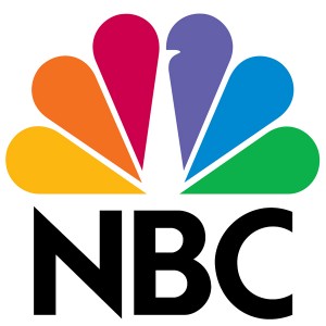
Ever wonder why NBC uses so many colors in their logo? The answer may have more depth than you think. During the 1950s, NBC’s owner was RCA, which had just begun to manufacture color televisions. Because RCA wanted people who were still watching the network on black-and-white televisions to know what they were missing (perhaps while in the TV section of the local department store), it was decided to create a colorful logo tout the newfound color technology.
3. Fed Ex
. 
The FedEx logo is a creative one. The first things you notice are the two different prevalent colors. A closer look reveals an arrow between the spaces of the letter ‘E’ and ‘X’, representing the company’s forward-thinking ways and outlook toward the future.
4. Tostitos

Have you ever noticed that two of the T’s in “Tostitos” represent two friends sharing chips and salsa? Tostitos puts a unique twist on its own name for a creative logo.
5. Toyota
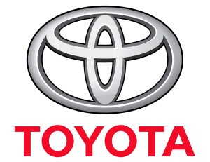
In addition to the “T” for Toyota, the automobile manufacturer’s logo includes overlapping ovals, which represent the intersection and connection of their customers’ and company’s hearts. Even the empty space behind the logo represents the boundless opportunities the future may bring. With all that meaning, you wouldn’t think there would be room for more. But look carefully at the three circles that are used to create the “T” shape, and you can actually find every letter from the word Toyota hidden inside. The company’s entire name fits right into this one simple emblem, which is relevantly important when you consider the fact that this logo is going on the grill of every customer’s car.
6. Toblerone

The Swiss chocolatiers at Toblerone are known for their unique triangle-shaped chocolate bars and their logo featuring an image of the Matterhorn. But for the viewer with a keen eye, there’s something hidden in that mountain peak. If you look at the white space on the mountain, you’ll see the image of a bear. What would make Toblerone want to hide a bear in their image? Because Toblerone is made in Berne, Switzerland and the bear is the symbol for Berne. Even the word Toblerone itself includes all the letters to spell out the word “Berne.”
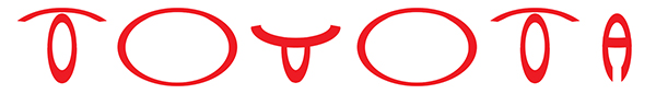
7. McDonalds
Most people are under the impression that these golden arches are french fries or the letter “M.” But the original golden arches are said to be a part of the original building design for the restaurant chain. The arches connected to an overhang that kept the rain and bad weather off of customers when they were ordering outside. The company discovered that those golden arches were easily seen from the interstates, which drove people to the restaurant. This is partially why the golden arches are still used as a symbol of the brand today.
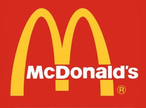
8. Adidas
In the 1990′s, the original three-striped logo was tweaked further and the stripes were turned diagonally on their side to create the shape of a mountain or climb. The new design kept the original idea of the first logo, while giving an actual purpose to those three stripes, which now represent the struggles athletes must overcome to achieve greatness.
9. Cisco
.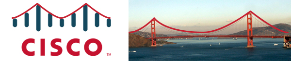
Cisco was founded in 1984 in San Francisco, so the Golden Gate Bridge shape is a tribute to the company’s roots. The name “Cisco” itself is even taken from “San Francisco” (which is why it’s not capitalized in the logo).
10. Pinterest
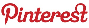
The social media site Pinterest is a play on the words “pin” and “interest,” since it allows users to pin things they’re interested in to a personalized board. Because the word “pin” and the act of pinning something to a board plays such a crucial part in the brand’s identity, the Pinterest logo has a pin design hidden in the letter “P.”
While you definitely have seen these logos before, have you learned anything new about the brand while taking a closer look at the messages behind their logos? Tell us what you think. We want to know what other logos you consider to be iconic or successful.